color spectrum three

Photographs, 2015-23

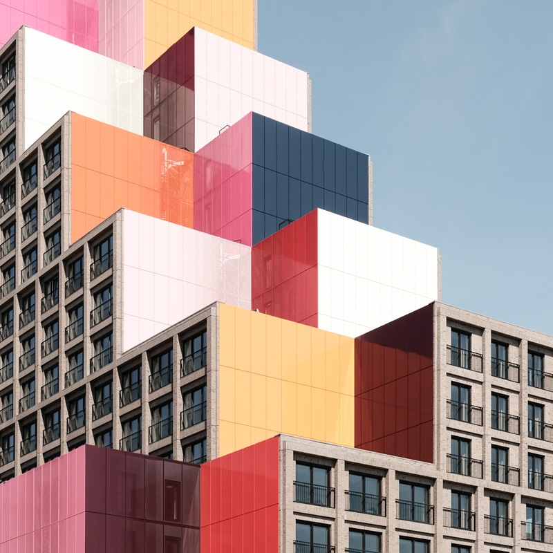
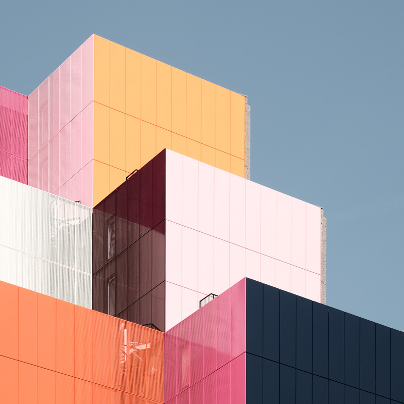
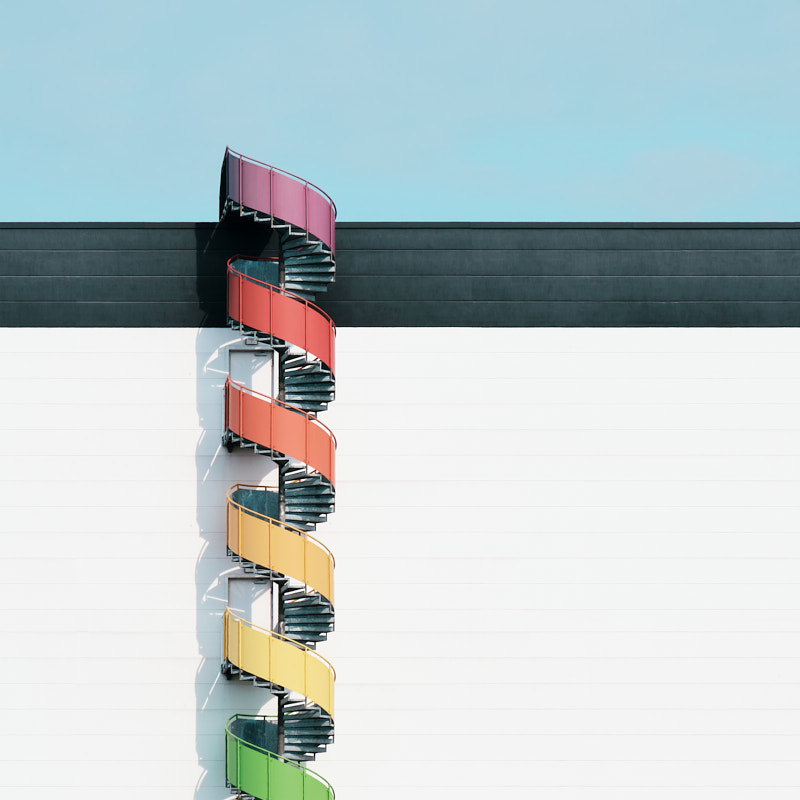
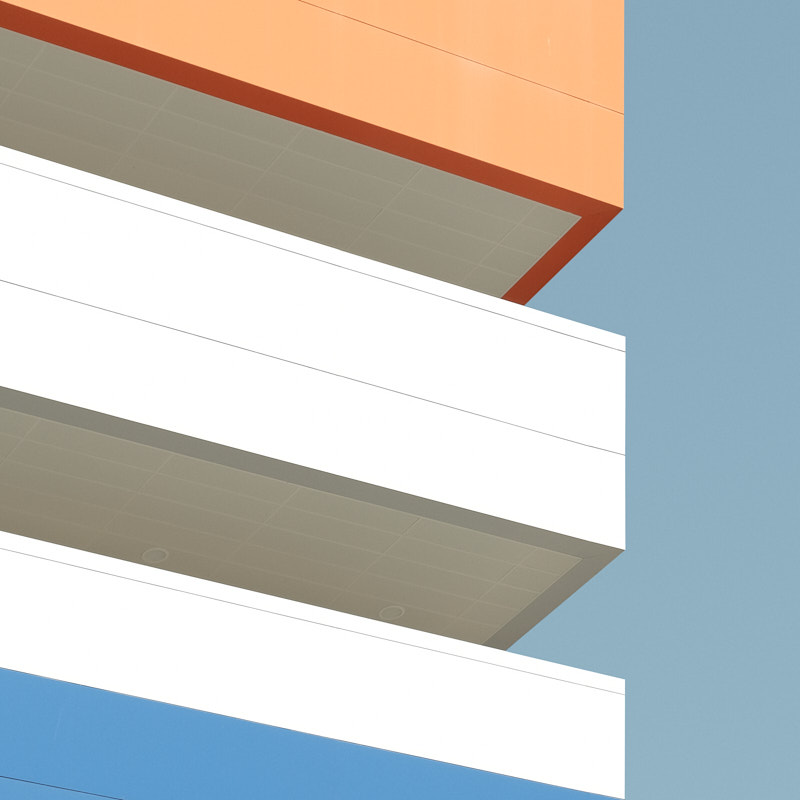
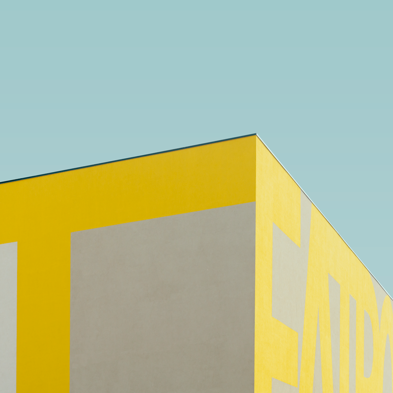
In color spectrum three, I move toward a palette of bold primary colors—tones that assert themselves with clarity and intention. These hues appear naturally in the built environment, yet once isolated, they take on a striking autonomy. Red, blue, and yellow become more than accents; they become structural forces that shape the rhythm and energy of each composition.

What interests me about these primary colors is their directness. They don’t soften or recede—they declare. A saturated blue can anchor a façade with a sense of depth and cool intensity. A vivid yellow introduces a sharp brightness that cuts through shadow and space. And red, in its purest form, becomes a pulse: immediate, directional, and unmistakably present. Together, these colors create a visual language that is both elemental and architectural.

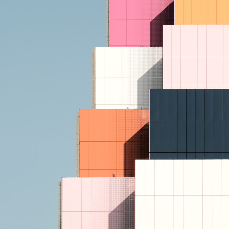
Working with primaries requires a heightened sensitivity to balance. Their strength can easily dominate, so the geometry must meet them with equal precision. Lines become more assertive; planes feel more graphic; shadows act as counterweights that keep the compositions grounded. In this series, color and form negotiate with one another—each pushing, each defining, each holding its own.

By reducing the images to these essential chromatic relationships, the architecture shifts into a more graphic register. Surfaces flatten into fields of color; edges become crisp boundaries; the built environment transforms into a kind of visual syntax. The result is not abstraction for its own sake, but a way of revealing how primary colors can heighten perception, sharpen attention, and intensify the experience of space.

Color spectrum three is ultimately an exploration of color at its most fundamental. These bold tones invite the viewer to engage with architecture through clarity and impact—to feel how pure color can energize a structure, redefine its presence, and create a sense of immediacy that is both playful and precise.

In relation to the earlier series, color spectrum three marks a shift toward intensity. Where color spectrum one explored the grounded warmth of reds and earthy tones, and color spectrum two drifted into the softness of pastels, this third chapter embraces color in its most assertive form. Together, the three series trace a progression—from weight to lightness to clarity—revealing how different palettes can reshape the emotional and structural experience of architecture.