color spectrum two

Photographs, 2015-23

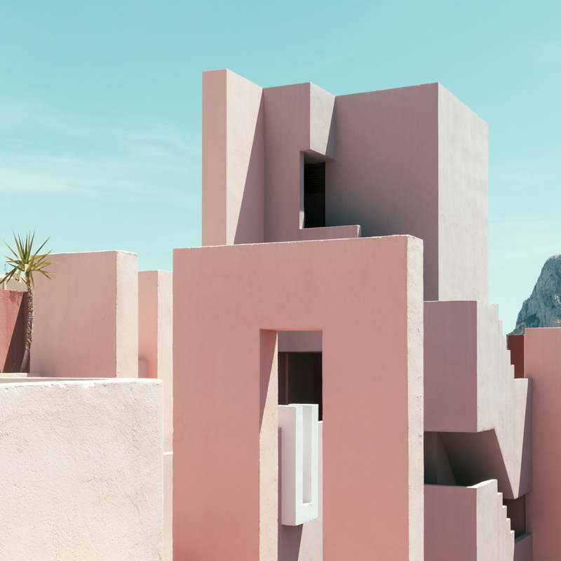
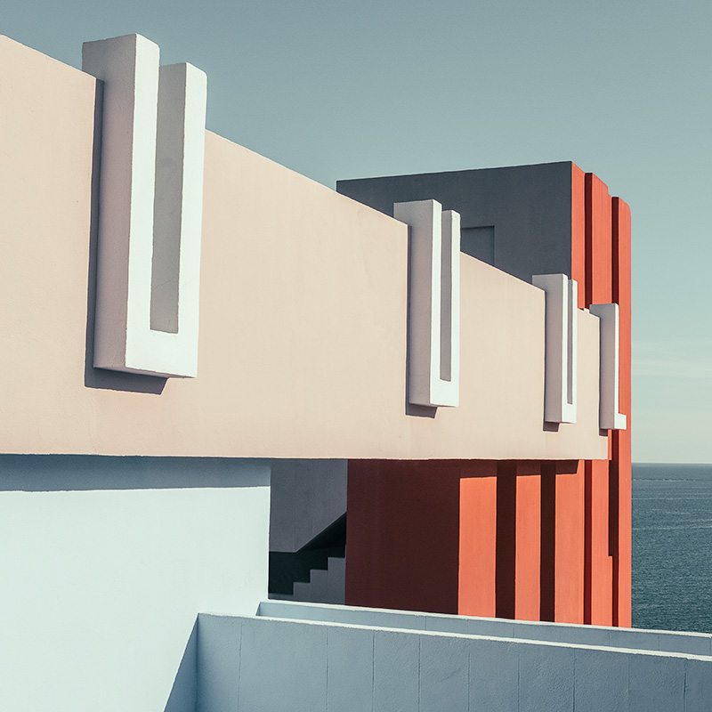
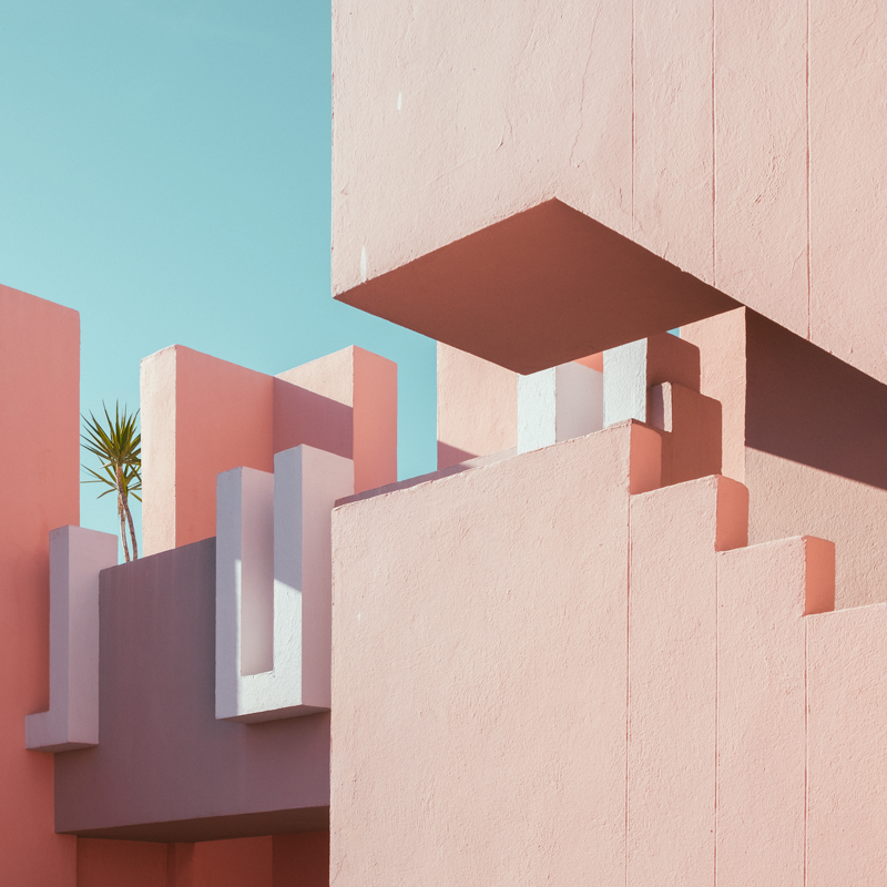
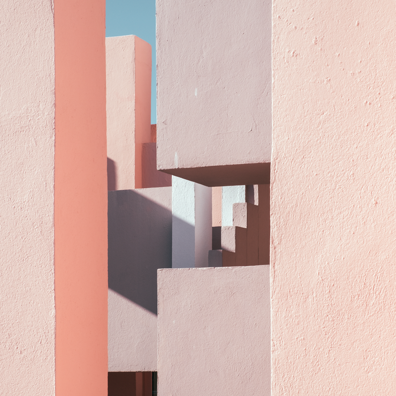
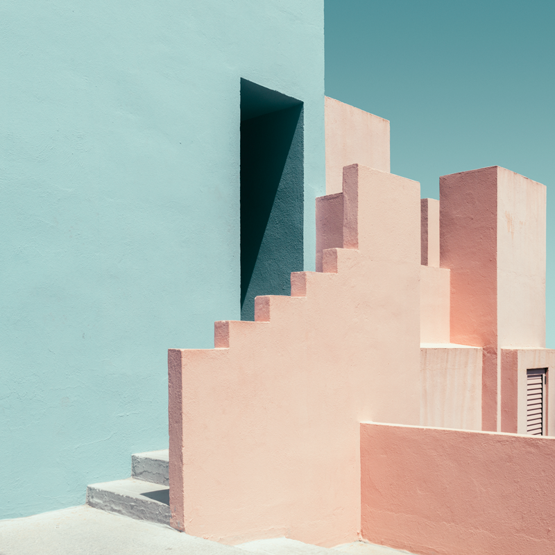
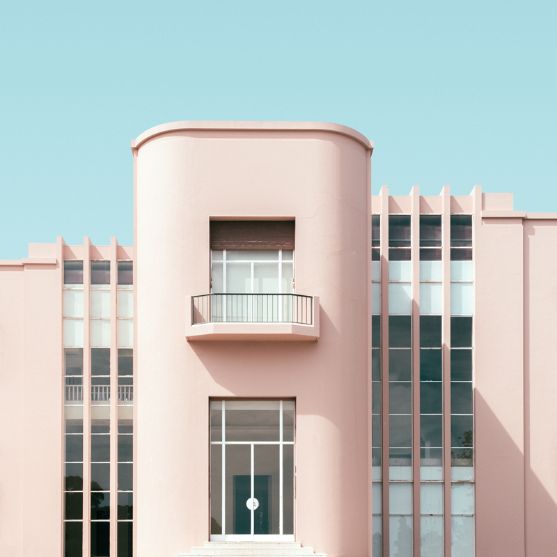
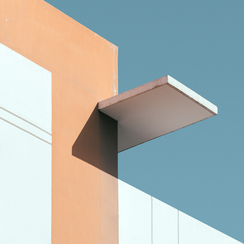
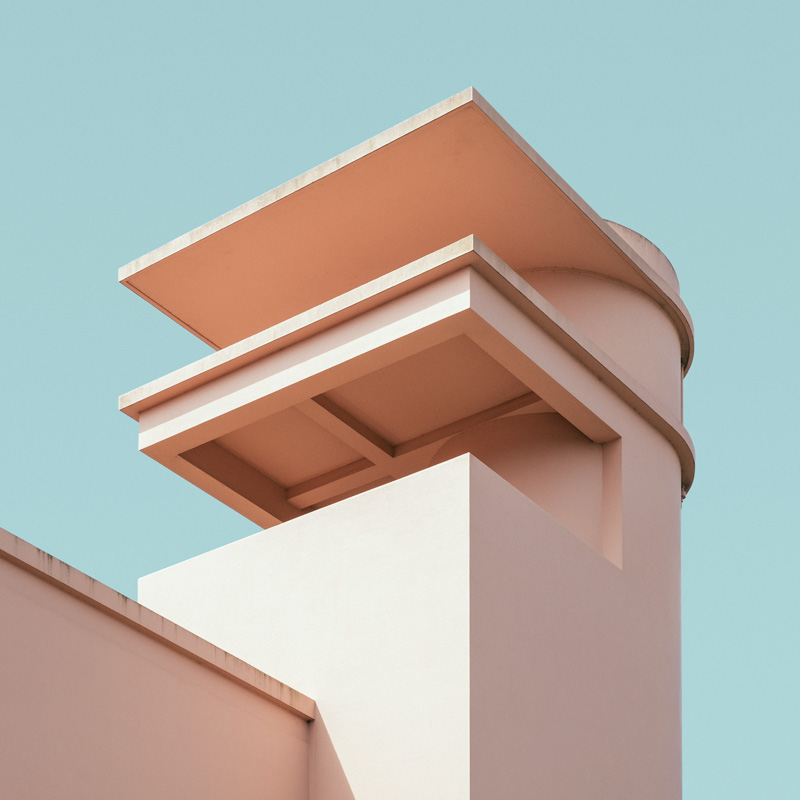
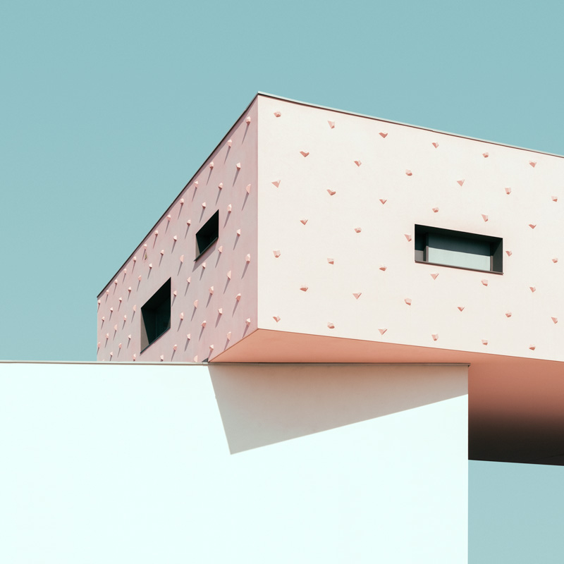
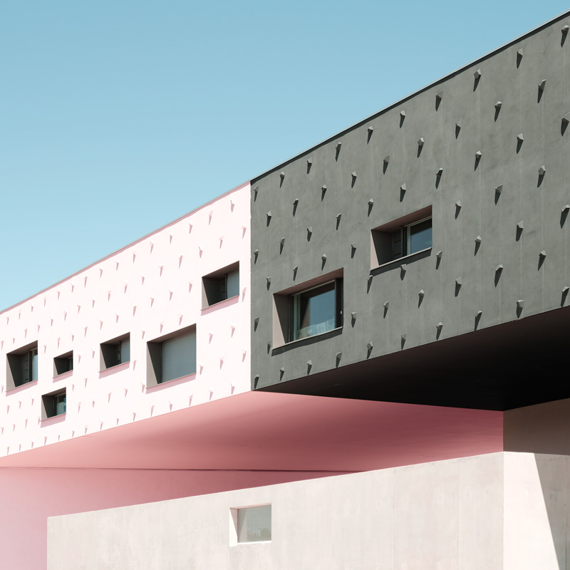
In color spectrum two, I shift my attention toward a palette of pastel tones. Colors that feel lighter, more diffused, almost weightless. These hues emerge naturally from the architecture I photograph, but once isolated, they begin to behave like soft atmospheres rather than surfaces. Pale blues, gentle pinks, washed-out greens, and muted creams create a visual language that is quieter and more open than the deeper tones of the previous series.

What interests me about these pastel colors is the way they soften the geometry of a structure. Hard edges become gentler transitions; large planes feel less imposing and more luminous. The architecture doesn’t disappear, but it loosens—its presence becomes more fluid, more suggestive. These tones allow the built environment to slip into a dreamlike register, where form is still precise but the mood is airy and contemplative.

Working with pastels requires a different kind of attention. The shifts between tones are subtle, and the balance between light and shadow becomes delicate. A slight change in brightness can alter the entire emotional temperature of the image. By reducing the compositions to these soft chromatic relationships, I aim to reveal how color can create a sense of calm without losing structural clarity.

Color spectrum two is ultimately about the quiet resonance of gentle color. These pastel tones invite the viewer to slow down, to notice nuance, and to experience architecture as a series of light impressions rather than fixed objects. They offer a softer way of seeing—one that embraces openness, subtlety, and the quiet beauty of restraint.